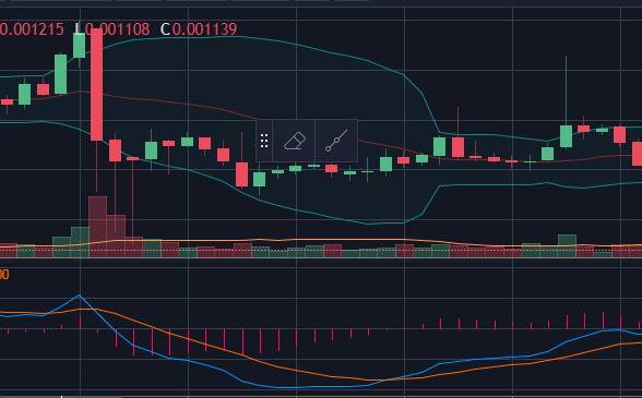
MACD indicator (Moving Average Convergence Divergence)
This indicator gives strong advice on buying/selling. It’s made up of two lines that are exponential adjustments to the moving average based on the last N transactions. These lines are sometimes overlaid with a buy/sell strength indicator. The lines are exponential moving averages and can be adjusted to whatever number of trades you’d like. The ones in my chart below are 12, 26

In the image you can see a small peak where the indicator shows that it would probably be a good time to sell. After that it slopes down crossing the other average line. You can see in the candles above how these lines correlate to market action.
The further the lines get from the middle the stronger the indicator is. Further up usually correlates with a better time to sell. Further down usually correlates with a better time to buy.
The distance between the lines themselves are also a good indicator of confidence in what the indicator is telling you. If they’ve crossed headed down and the distance between them is increasing the market’s selling off pretty hard. Same goes for the other direction.
When trading you want to trade as close to the crossing of these lines at the top/bottom as possible to maximize profitability. The problem with that is this indicator is also delayed due to the fact it uses the previous N trades to calculate itself.
In trading nothing is certain but the more you’re familiar with indicators and what they mean to the market you can gain confidence by aggregating what multiple indicators are telling you. Candles coming down to the bottom b-band and MACD looks like it’s about to cross? Probably a decent indicator it’s a safe time to buy. Switch to a lower interval chart and see what it’s doing. Switch to a higher interval chart to see where you are in the grand scheme of things to make sure you’re not at/near an all time high. Be smart about it.
